Correlation Matrix Visualization of Car Crashes

Load the ‘car_crashes’ dataset and visualize a heatmap of the correlation matrix. Highlight cells with a correlation higher than 0.8 in a different color.

Example Output:

Utilize sns.heatmap, and fetch the car_crashes dataset using sns.load_dataset('car_crashes').

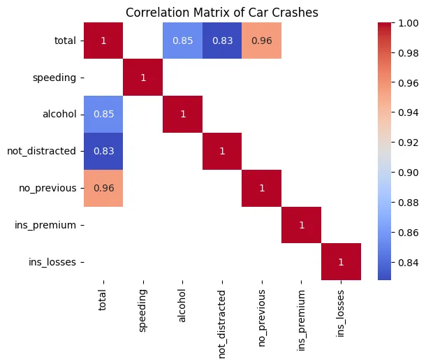
import seaborn as sns
import matplotlib.pyplot as plt

def plot_car_crashes_correlation():
    crashes_data = sns.load_dataset('car_crashes')
    correlation = crashes_data.corr()
    mask = correlation > 0.8
    sns.heatmap(correlation, annot=True, mask=~mask, cmap="coolwarm")
    plt.title('Correlation Matrix of Car Crashes')
    plt.show()

plot_car_crashes_correlation()


© Let’s Data Science

LOGIN

Unlock AI & Data Science treasures. Log in!