What happened
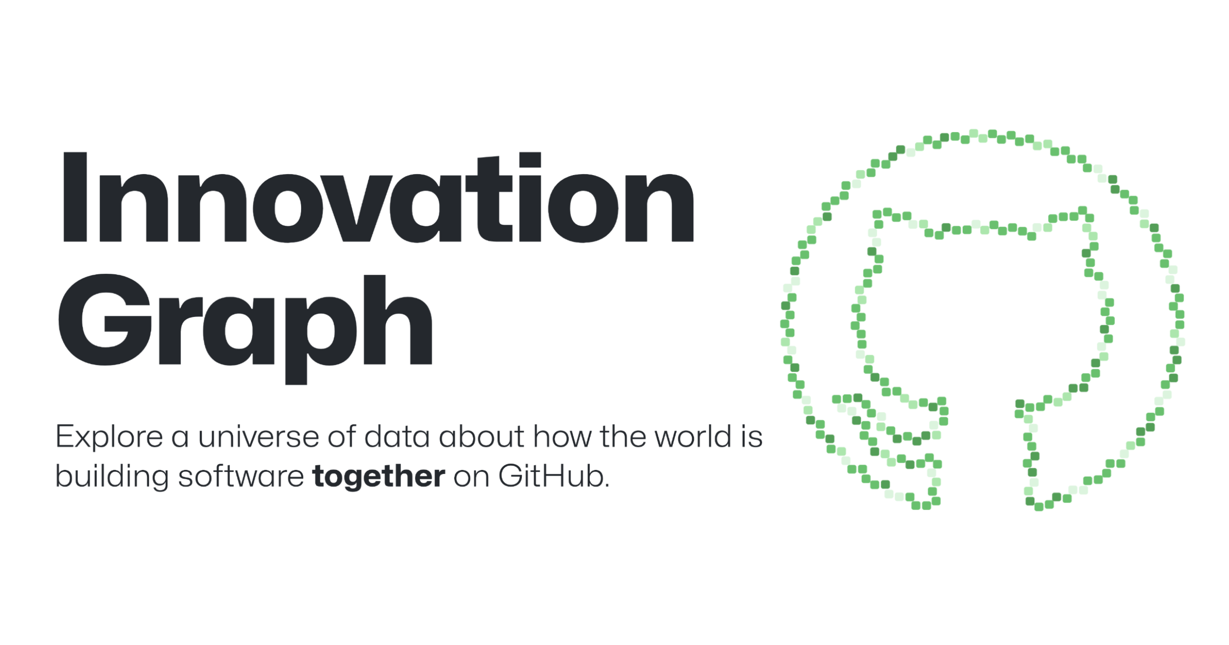
Per a GitHub blog post published May 8, 2026, a paper appearing in Research Policy uses the GitHub Innovation Graph to construct a measure of national "digital complexity" and evaluates whether that measure predicts GDP, inequality, and emissions beyond traditional economic indicators. The GitHub post identifies the authors as Sándor Juhász (Corvinus University of Budapest), Johannes Wachs (Corvinus University of Budapest; Complexity Science Hub Vienna), Jermain Kaminski (Maastricht University), and César A. Hidalgo (Toulouse School of Economics; Corvinus University of Budapest). The blog also accompanies GitHub's Q4 2025 Innovation Graph data release. A separate GitHub post dated January 28, 2026, catalogs additional academic uses of the Innovation Graph, including studies of cross-national collaboration and historical institutions in digital production, which GitHub highlights as applications of the dataset.
Editorial analysis - technical context
Researchers using repository- and contributor-level aggregates typically treat open-source activity as a proxy for digital capabilities and knowledge networks. Industry-pattern observations: network analysis, capability-space mapping, and complexity indices are common tools for converting bipartite developer-project data into country-level indicators. Causal inference in this setting often combines panel regressions with robustness checks or causal machine-learning methods to test links between digital indicators and macro outcomes; GitHub's posts note that network analysis techniques are a common approach for Innovation Graph-based studies.
Industry context
For researchers and policy analysts, scalable, regularly updated datasets like the GitHub Innovation Graph lower barriers to measuring software-driven economic activity across regions. Observed patterns in similar work show such digital-activity indicators can reveal structural differences that standard surveys miss, but they also inherit biases from platform coverage, language, and sector representation. GitHub's continued quarterly releases expand temporal coverage but do not by themselves resolve representativeness concerns.
What to watch
Researchers and practitioners should follow reproducibility (code and methodology disclosure), geographic and sectoral coverage notes in future Innovation Graph releases, and how authors validate digital-complexity indices against independent economic and emissions data sources. Observers will also watch extensions that combine Innovation Graph metrics with firm-level, labor-market, or patent data to triangulate macroeconomic signals.
Key Points
- 1GitHub-hosted research uses the Innovation Graph to build a national "digital complexity" indicator, offering a new lens on GDP, inequality, and emissions.
- 2Regular **Q4 2025** Innovation Graph releases enable broader temporal studies, but platform coverage and language biases remain key limitations for cross-country inference.
- 3Industry-pattern observation: network and complexity methods convert developer-project data into aggregate capability measures useful for economic and policy research.
Scoring Rationale
The story documents a notable application of a large, public developer dataset to macroeconomic measurement, which matters to researchers and policymakers studying digital economies. It is useful but not a paradigm-shifting advance for AI/ML practitioners.
Practice interview problems based on real data
1,625 SQL & Python problems across 15 industry datasets — the exact type of data you work with.
Try 250 free problems