import seaborn as sns
import matplotlib.pyplot as plt
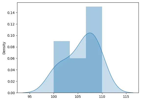
def plot_stock_distribution(prices):
sns.distplot(prices, kde_kws={"shade": True})
plt.show()
# This function can be called with a list of stock prices.
# For the sake of this example, let's assume a random list of stock prices.
prices = [100, 101, 103, 105, 106, 107, 108, 110, 109, 108]
plot_stock_distribution(prices)